Digital Banking Revolution
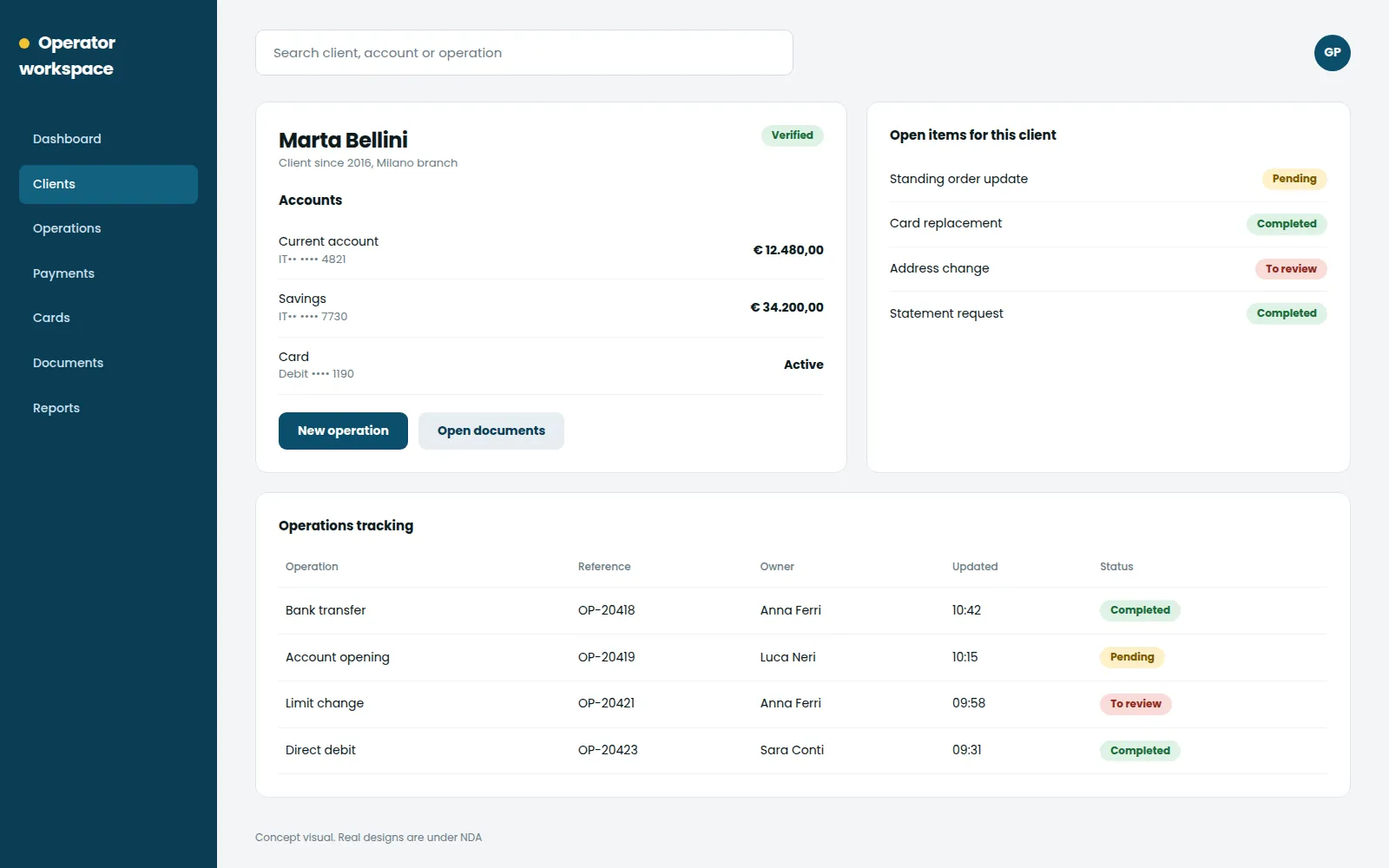
Even a simple bank operation meant jumping across several tools. I turned it into one place
Overview
For over four years I worked on an enterprise fintech platform for Italian banks. I started as Product Owner and moved into UX design, so I have seen this product from the roadmap and from the screen. The job: replace a scattered set of outdated, disconnected banking tools with one platform built on research, and keep strategy, design and delivery pulling in the same direction.
The problem
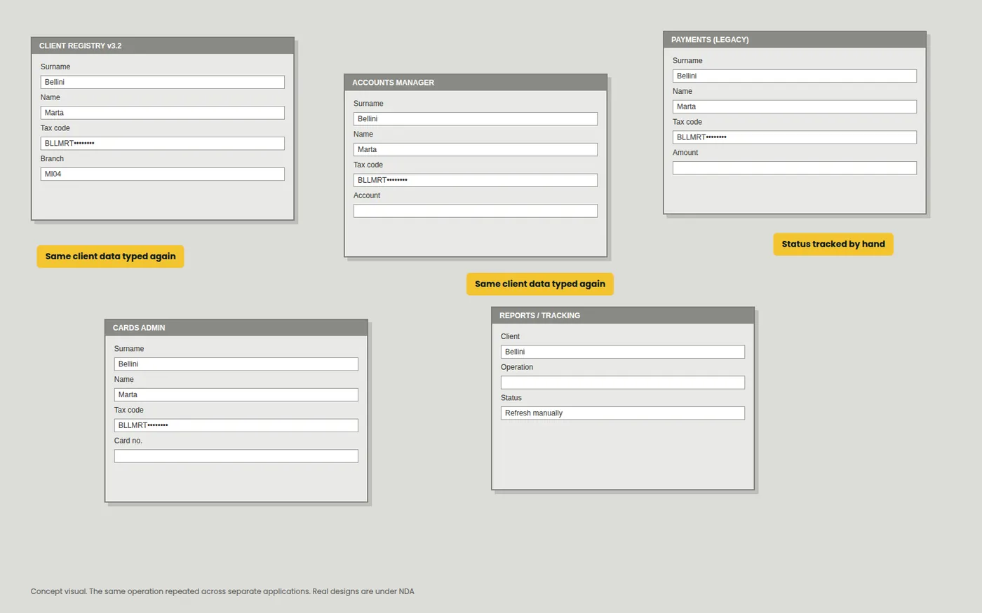
Picture a bank operator on a normal day. To handle one client they move across several old, monolithic applications that barely talk to each other, retyping the same data, tracking things by hand, hoping nothing slips. Nobody designed that workflow. It piled up over the years. The cost: repetitive work, slower days and a constant risk of mistakes.
Process
Inception
Context
An enterprise platform for bank operators, living among outdated, disconnected monolithic applications. The same tasks kept coming back, redundant and slow.
Goal
One user centred platform for the whole internal ecosystem of banking products: more efficiency, less manual work, better usability
Discover
Research
- Stakeholder interviews
- Contextual inquiries with bank operators
- Desk research and heuristic reviews of existing systems
Findings
- The same operations were repeated across multiple tools
- Missing integration caused delays, confusion and errors
- Cluttered, inconsistent interfaces needed constant support
Journey
Our main persona is a bank operator handling many transactions and client accounts every day. Their journey was full of system switching, data re entry and manual tracking.
Design
Approach
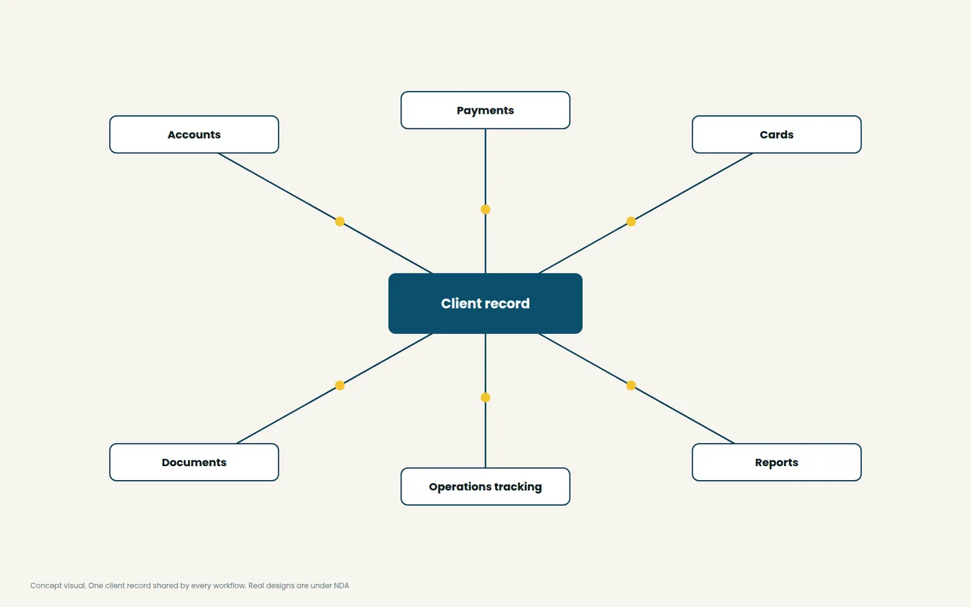
- Information architecture mapped to integrated workflows
- Low fidelity wireframes to align stakeholders early
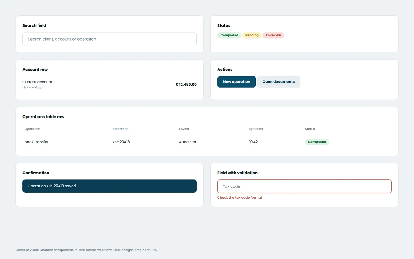
- Modular components for repetitive actions
- Clarity, accessibility and scalability in the UI structure
Test
Methods
- Usability testing with internal users on low fidelity prototypes
- Comparisons of legacy and proposed flows
- Heuristic evaluations of the redesigned journeys
Insights
- Users found the new flow more intuitive and much faster
- Simpler client search and operations tracking reduced errors
- Early testing let us pivot before costly development
Develop
Specs
- Documentation for each component and flow
- Shared design system and UI kit for consistency
- Handoff with annotated Figma prototypes
Measure
Metrics
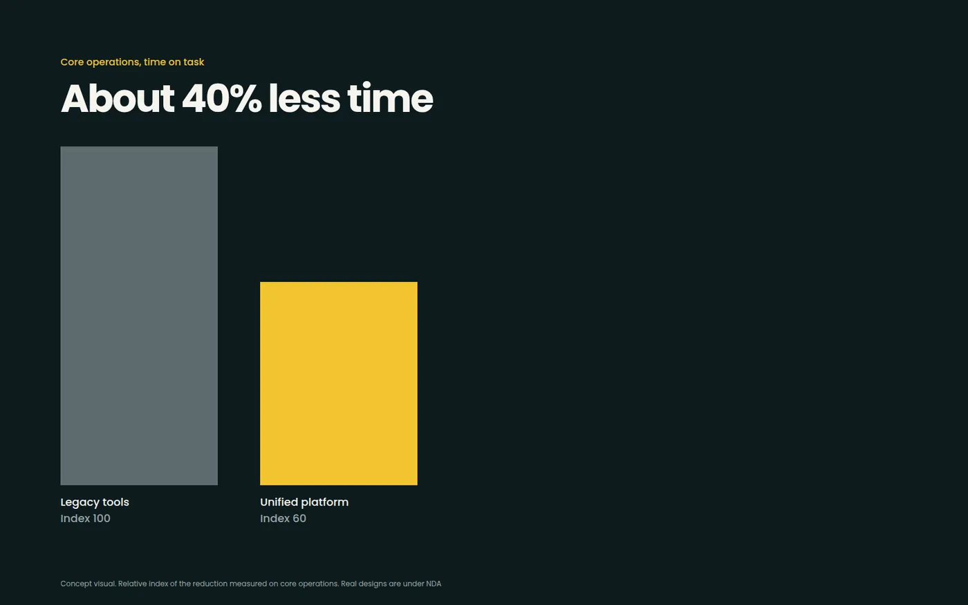
- Time on task down by about 40% for core operations
- Higher task success rate in testing
- Positive feedback from internal bank users and support teams
Outcome
The number I care about: about 40% less time on core operations. Behind it, fewer copy and paste errors, less frustration, and teams that finally trusted the tools in front of them.
Learnings
Two things pulled at me all the time: the strategic vision of the product and the hands on design work. Legacy systems taught me to adapt and get creative, and working close to developers and stakeholders kept what we wanted both feasible and useful. Real designs are under NDA, so the visuals on this page are concept illustrations.